Meaningless Metrics and Why A/B Testing Matters

I was catching up on Tangyslice’s blog and enjoying his 5 meaningless marketing metrics post, when I thought of another meaningless metric.  Last week I was reading a presentation which described the response rate of one group as slightly greater than the control group.  What does slightly greater mean in this context?  Well, it turns out the difference was statistically significant once I did the math.  What I find meaningless is when analysts do not look for statistical significance when comparing two groups.  This is known as A/B Testing.

Conceptually A/B testing is very simple.  You are comparing Group A to Group B.  A might be a control group and B the test group.  Alternatively, A and B might be two different offers, landing pages, e-mails, direct mail lists, or landing pages.  As the name suggests, this is a test which is why A/B testing is also known as split testing.  Ultimately, you want to know if A and B differ in a way that is statistically significant.

Here’s an example to make it concrete. Let’s say that you marketed to 50,000 customers encouraging them to purchase product A and 5,000 of them responded. That is a 10% response rate. In addition, there were 5,000 customers that you could have marketed to but that you did not.  Instead, you assigned them to the control group.  They look and act just like the 50,000 customers that you mailed. The reason for the control group is that some customers might buy product A regardless of whether you market to them or not.  In this example, 450 of them or 9% purchased the product. Is the difference between 10% and 9% statistically significant?  Was the campaign successful?

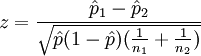
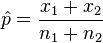
In this case, we perform the two-proportion z-test for equal variances using the following formula:

z=\frac{\hat{p}_1 - \hat{p}_2}{\sqrt{\hat{p}(1 - \hat{p})(\frac{1}{n_1} + \frac{1}{n_2})}} and
\hat{p}=\frac{x_1 + x_2}{n_1 + n_2}

where…

p1=10% (response rate for Group A)

p2=9% (response rate for Group B)

x1=5,000 (number of responders in Group A)

X2=450 (number of responders in Group B)

n1=50,000 (quantity mailed in Group A)

n2=5,000 (quantity mailed in Group B)

If the value of z is greater than 1.96 then the difference is significant at 95% confidence.  In this case, the z value is 2.26 so the difference is statistically significant.

In order for the test to be valid a few assumptions must be met:
1. Your control group needs to contain customers or prospects that look and behave like the treatment group
2. You need to have sufficient numbers of direct mail recipients and responders such that n1 p1 > 5 AND n1(1 − p1) > 5 and n2 p2 > 5 and n2(1 − p2) > 5 and n2>29 and the groups contain independent observations

The math might look scary but really the hard part is making sure that the test is done properly.  It is vital that the control contains a random selection of customers who are similar to the treatment group.  If not, you could end up with very strange results

Marketing Analysts Take Over Boston

Last week I attended a Marketing Analytics conference  in Boston sponsored by iKnowtion.  At a time when companies are cutting expenses, including staff and marketing budgets, iKnowtion is investing in their future.  They are also engaging in a dialogue with the larger Marketing Analytics community through the conference and their blog.  (In the interest of full disclosure, I know several people at iKnowtion but have never worked there.)

The conference began with a talk by Tom Davenport, the Author of Competing on Analytics with Jeanne G. Harris.  He set the stage by providing examples of how companies recognize the importance of analytics but reminded us that marketing is still a combination of art and science.  As the emphasis shifts more towards the science of marketing, we need to recognize that the “art” is still relevant.  He further challenged us to move beyond reporting to provide more value and insight.

Next was a panel on driving business value featuring speakers from GM, CVS Pharmacy, and ConstantContact.  Each speaker provided a brief case study of how analytics has helped their business.  In one case, analytics changed the focus of the business.  In another, it led to the rebalancing of product marketing.  Finally, the rigors of “test, measure, and learn” enabled one company to optimize media effectiveness across channels.

After lunch there was a lively digital panel discussion around social media, the future of web-enabled communities and the challenges of measuring the impact of companies’ efforts in this space.  Given the evolving nature of social media, it is no surprise that there were divergent opinions.  I, for one, appreciated the candor and the healthy discussion that ensued.  To quote Jane Austen, “My idea of good company…is the company of clever, well-informed people, who have a great deal of conversation.”

The conference wrapped up with a return to the theme of competing on analytics.  This free flowing discussion touched upon a range of topics, including how to become a company that uses analytics for competitive advantage.  Interestingly, one of the panelists thought that finding good talent was the biggest challenge we face.  As a Marketing Analytics professional who hires and develops staff, I am in complete agreement.  There is stiff competition for the best analytic staff and I have found it difficult to find technical competence coupled with business acumen.  In fact, the discussion about finding, training and retaining analytic staff continued at the bar, after the conference formally ended.

iKnowtion has plans to hold the conference again next year and I encourage you to attend.

What is the value of social media?

As much as I like to measure and quantify, it is too early to try to assign a dollar value to social media.  Marketers are still trying to figure out how to use social media effectively.  Until they do, they will not be able to measure the impact of social media on their efforts and their brands more generally. 

If you are interested, Limeduck has posted about a tweet up held by a Boston radio station, WBUR, to explore and discuss social media.  Also, Tangyslice has also begun interviewing “real people using Web 2.0 to improve the way they do business”.

How do you prioritize new customers?

I was asked recently how to prioritize new customers if you do not have demographic or firmographic data available.  In other words, what can you do with just the data from the first purchase with which to work?

To make this more concrete, let’s consider the following situation.  You are asked to call each and every new customer who has made a purchase.  The question is, how do you prioritize the calls?  You want to make the first calls to those with the greatest potential to become loyal and valuable customers.  The only data available relates to the first purchase:  total revenue generated, products purchased,  product revenue, etc. 

In this case, a linear regression could be used to help you identify the factors that predict lifetime value.  (Other types of models can be used depending on the independent and dependent variables available.)  Using your existing customer base, build a model that leverages data about the first purchase to predict lifetime spending.  You can identify the best and worst new customers using the resulting model equation.  Armed with this insight, you can test your model by calling on new customers with the best predicted lifetime revenue and a random selection of new customers regardless of predicted lifetime revenue.  In addition, you can test call back timing to determine if there is an optimal call back window. 

Even with limited data, analysis can lead to insight.  Further, there is always an opportunity to incorporate testing.  In this case, testing can validate initial findings and help you learn more about the purchase cycle.

Will Marketers Never Learn?

If you have been reading Limeduck like I have, you might have read about a Rockport print ad showing shoes that are not available for purchase.  As I noted on that website, this has happened before.  In a Marketing class several years ago, my professor showed a television ad featuring a car that could not be purchased.  As you can imagine, consumers saw the car and went to their local dealerships looking for that car only to learn that it wasn’t available.  Given that high profile mistake, I am surprised that Rockport made the same gaffe.

And yet, just today I received an e-mail that I wanted to share.  In an earlier post, I talked about how some e-mail programs do not load images.  This was in the context of measuring the open rate of an e-mail.  However, the fact that some e-mail software turns images off by default also affects the look and feel of an e-mail.  Here’s what the e-mail looked like:

In the image above, pictures have been replaced by boxes featuring red squares, blue triangles and green circles.  All of the time spent crafting a beautifully designed e-mail is lost if recipients cannot quickly read about the offer(s) and easily engage with the e-mail. I certainly did not bother to display the images in this e-mail.